Modernizing a security platform used by 10,000+ subscription customers - for better engagement, faster workflows, and a UI that finally matches the product's power.
Overview
( 01 - The Project )In January 2025, we shipped a brand new experience for the Qualys Platform - used by a majority of the Forbes Global 100 and Fortune 100. The redesign significantly improved user efficiency and made the platform easier to navigate, learn, and love.
- Define Business Goals
- Gather User Issues
- Competitive Analysis
- Primary Goals for UX
- Pointers for design
- Wireframing for New Concepts
- Early User Testing & Feedback
- Defining Foundation Elements
- Redesigning Components & Layouts
- Evaluation & Hand-off to Engineering
- Design Testing
The Problem
( 02 - User Issues )Speaking to Qualys users was super insightful and helped us pinpoint major issues with the current UI beyond just the visuals. Three complaints came up again and again.
"Most of the important data is being pushed under the scroll."
User 1
"Every time I need to scroll to the bottom of the huuge list of modules."
User 2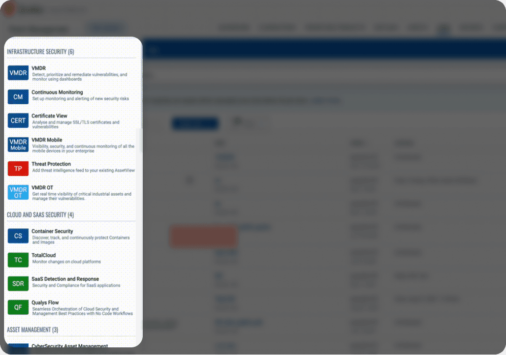
"We could only apply 1 filter at a time - there was no option to select multiple."
User 3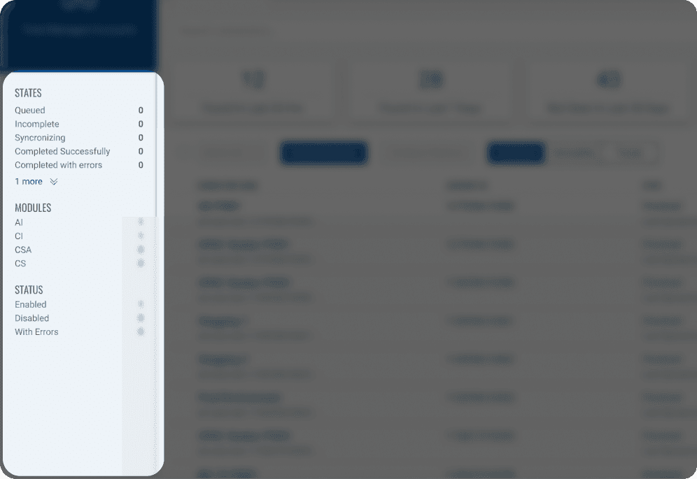
Research
( 03 - Competitive Analysis )After gathering user issues, I collated navigation examples from key competitors and ran a detailed comparison of UI elements across cybersecurity products - looking for patterns worth adopting and gaps worth exploiting.

Among the most-used navigation patterns, quite a few players in the cybersecurity space follow a Left–Top–Top structure - and in testing, users preferred it by a significant margin.


Goals & Objectives
( 04 - Business & UX )The revamp had to serve the business as much as the user. These goals - split across business needs and UX priorities - framed everything that followed.
Iterative improvements for a seamless transition. We focused on delivering the most critical UX improvements first, while strategically introducing additional enhancements to optimize adoption and minimize friction.
Process
( 05 - Wireframes & Concepts )Once the key areas were clear, I explored high-level navigation and layout concepts. After discussions with the team and stakeholders, two options were shortlisted - each tested with users via an A/B flow before one was carried forward.
A user flow was designed for A/B testing, incorporating two finalized visual design strategies. This flow required users to interact with the revamped navigation and redesigned UI elements.

Foundations
( 06 - Defining the Foundational Elements )Before high-fidelity design, I set up the core building blocks, starting with a refined color palette with expanded options and proper contrast for a more accessible, scalable system.
The icon library, with over 500 icons, was updated to match the new visual style, and text-style tokens were defined to maintain consistency across all layouts.
I also led the work on our design system, which consists of 70+ configurable components with multiple variants for easier global updates and a more systematic approach to scaling design changes.
Final Designs
( 07 - Bringing It Together )Cleaner layout, improved navigation, and thoughtful interactions - covering every distinct layout in the platform, with the most common and critical components targeted for Phase 1.
The final screens feature a cleaner layout, improved navigation, and thoughtful interactions that make the platform easier to use and more visually engaging.
A walkthrough of every distinct layout we redesigned across the platform, brought together in one place.
Outcome
( 08 - Proven Results )The new UI launched with the announcement of Qualys Enterprise TruRisk Management, receiving overwhelmingly positive feedback at QSC and reinforcing Qualys' market leadership. A built-in feedback option let users share input while transitioning.
Only 2% of users opted to switch back to the old UI - the rest never looked back.
"Many existing customers showed strong interest in becoming design partners."- Feedback at QSC Launch