Turning a slow, manual process into self-service software for telecom partners - replacing weeks of email-and-spreadsheet back-and-forth with something that takes minutes.
Client name and certain details are withheld under NDA. Visuals are generalized to protect confidentiality.
I designed a self-service tool that lets telecom partners get set up, and manage phone numbers in bulk on their own - built for one of the largest mobile carriers in the US, serving partners who manage numbers in batches of tens to hundreds of thousands.
The Setup
( 01 - Context )Some companies need phone numbers in huge quantities - tens or hundreds of thousands at a time - to power apps, send messages, and route calls for their own customers. My client provides those numbers wholesale, but there was no product for partners to actually get and manage them.
A partner who needed 20,000 numbers sent an email. An internal team processed it by hand using spreadsheets. The partner waited - sometimes weeks - with no way to see progress, no explanation when something didn't work, and no way to set up or hand back numbers themselves.

Design the self-service product that replaces all of that - where partners search for numbers, request them in bulk, track progress, and configure or return them without ever emailing a human.
The Real Challenge
( 02 - What Made It Hard )This wasn't a simple e-commerce checkout. Three things made it genuinely hard - and each one shaped the design.
Partners think in big batches ('give me 20,000'). But each number costs money every month and has its own settings. It had to feel effortless for huge batches yet still let someone manage a single number.
Every active number costs the partner money, and returning a number can't be undone. Giving partners control also meant protecting them from expensive, irreversible mistakes.
Fulfilling a request takes time and often only partly succeeds - a request for 20,000 might return 18,000 because a region ran out. 'In progress' and 'partly done' had to feel trustworthy, not broken.
How do we hand partners full control over something expensive, irreversible, and slow - and make it feel calm and obvious the whole way through?- The question I kept returning to
Telecom Supply Chain
( 03 - Research )Phone numbers don’t appear from nowhere. They flow through a chain of three players — a supplier, a carrier, and the businesses building on top. Only one of them uses the product. The other two shape it.
“Numbers are regulated — every move must be tracked.”
- Which numbers can be issued in which regions
- How quickly inventory can be allocated
- What gets logged for audit and compliance
“Numbers are assets — distribute them responsibly.”
- Pricing model (flat fee per active number)
- Eligibility checks before activation
- What partners can and can’t do without intervention
“Numbers are fuel — if I run out, my product stops.”
- No real-time visibility into availability
- Days or weeks of waiting after a request
- No early warning before she runs low
- No way to fix what failed without starting over
Ava is the only one of the three who actually uses the product — so she’s who I designed for. Owen and Colin don’t disappear; their rules, prices, and constraints show up in every screen as eligibility checks, pricing tiers, and audit trails. Understanding the whole chain is what made it possible to design for one user in it without breaking the others.
Structuring the Product
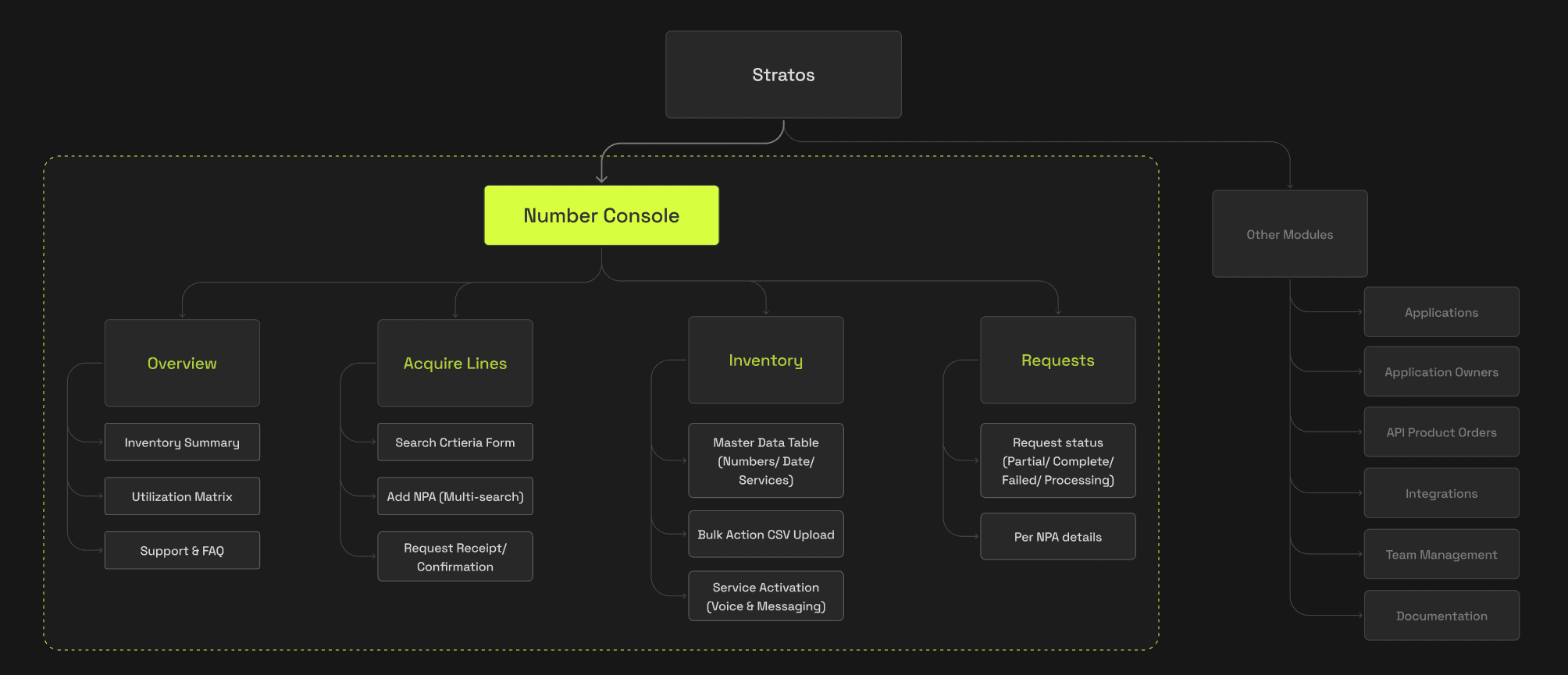
( 04 - Information Architecture )I organized everything around the four real jobs a partner does, in plain terms - each section answering one clear question.
I kept things I'm waiting for (Requests) separate from things I own (Inventory). An early version mixed them and instantly felt confusing - people couldn't tell what was real versus pending.

The “Numbers without services” count is the dashboard’s most opinionated decision — idle numbers cost money every month, so surfacing that figure makes the cost of inaction visible. It’s the first thing an operations manager should see.
The Decisions That Mattered
( 05 - Key Choices )Rather than tour every screen, here are the five choices I'm proudest of - each solving a specific human problem.
Getting numbers: describe, don't browse
You can't scroll through 20,000 numbers. Instead, partners describe what they want (area + quantity), hit Check Availability to see what's actually free, and confirm before committing. The price is shown right there, so the bill is never a surprise.

Requests: making 'partly done' make sense
The requests screen opens with four simple status tiles, so a manager sees the whole picture in a glance. Tapping in shows a plain-English reason for every line. This one detail killed days of "why did this fail?" email threads.

Designed to scale: at 50,000 numbers, you can't list every failure as its own row. Reasons aggregate. "1,247 numbers limited by area code 415" becomes one expandable group, not 1,247 errors. Users filter by status, not by row, so partial failures stay legible at any volume.

Setting up a number: a guided two-step
Turning on a service (like voice or messaging) used to fail constantly because a required setup step got skipped. I turned it into a short two-step wizard that won't let you finish until the requirements are filled in - the most common failure simply became impossible.
Handing numbers back: friction on purpose
Returning numbers can't be undone. So the action is easy to find but deliberately hard to fire by accident: a warning, a clear count of what's affected, and an "I understand this can't be undone" checkbox that must be ticked before the button works. Fast for the sure, impossible for the careless.

Bulk by spreadsheet: meet people where they are
Partners live in spreadsheets, so I let them upload one to act on thousands of numbers at once. The system checks the file and confirms in plain terms ("all 5,400 numbers found") before anything happens - validate first, commit second.

Impact
( 06 - How We'll Measure It )This product launches shortly, so I won't pretend I have live results yet. Here's what I can stand behind today, and the signals we'll watch once it's in partners' hands.
of partner number management was manual before this - every request handled by people and spreadsheets. The clearest measure of success is how much of that work disappears.
The teams closest to the old manual process could follow each flow without explanation.
'Partly done' status and plain-language reasons consistently read as clear - the exact thing that used to trigger back-and-forth.
Setup steps that previously failed are now structurally impossible to skip - an entire category of error designed out.
What I Took Away
( 07 - Reflections )The most valuable thing I designed wasn't a screen - it was a shared, plain-language way to describe what's happening. When 'partly done - region ran out' means the same thing everywhere, trust builds itself.
I learned to treat friction like a tool: none for safe actions, layered for irreversible ones - rather than something to remove everywhere.
Grouping people by their job in the bigger system predicted their needs far better than titles or demographics ever did.