Personal ProjectAndroidBuilt with Claude Code

How Claude helped me buildan app of my own

Landscape Ambient Player - teaching my phone what to show when it's lying on its side.

Role
Solo: idea, UX, visual design and the build. I don't write code; I built it with an AI coding assistant (Claude Code).
Timeline
13–17 August 2026, then 13–15 October 2026, mostly late evenings
Platform
Android, tested only on my own Pixel 9
Tools
Figma, Android Studio, Claude Code, Google Sans Flex
Status
Personal project, running on my phone. Not on the Play Store.
The landscape music player on a locked phone
( TL;DR )
Problem

I play Counter-Strike at night with Spotify on. Changing a song meant alt-tabbing out of the match, or poking at a sideways lock screen.

What I made

When the phone is locked and turned sideways, it shows a landscape music player by itself, or a bedside clock when nothing is playing.

What I learned

Being able to build by describing things made me skip drawing them. Things got better once I went back to Figma.

The phone was already in the right place, at arm's length and facing me. How do I get it to show the right thing, without asking me to touch it?

The Setup

( 01 - The Phone Was in the Right Spot )
( Showing the wrong thing )

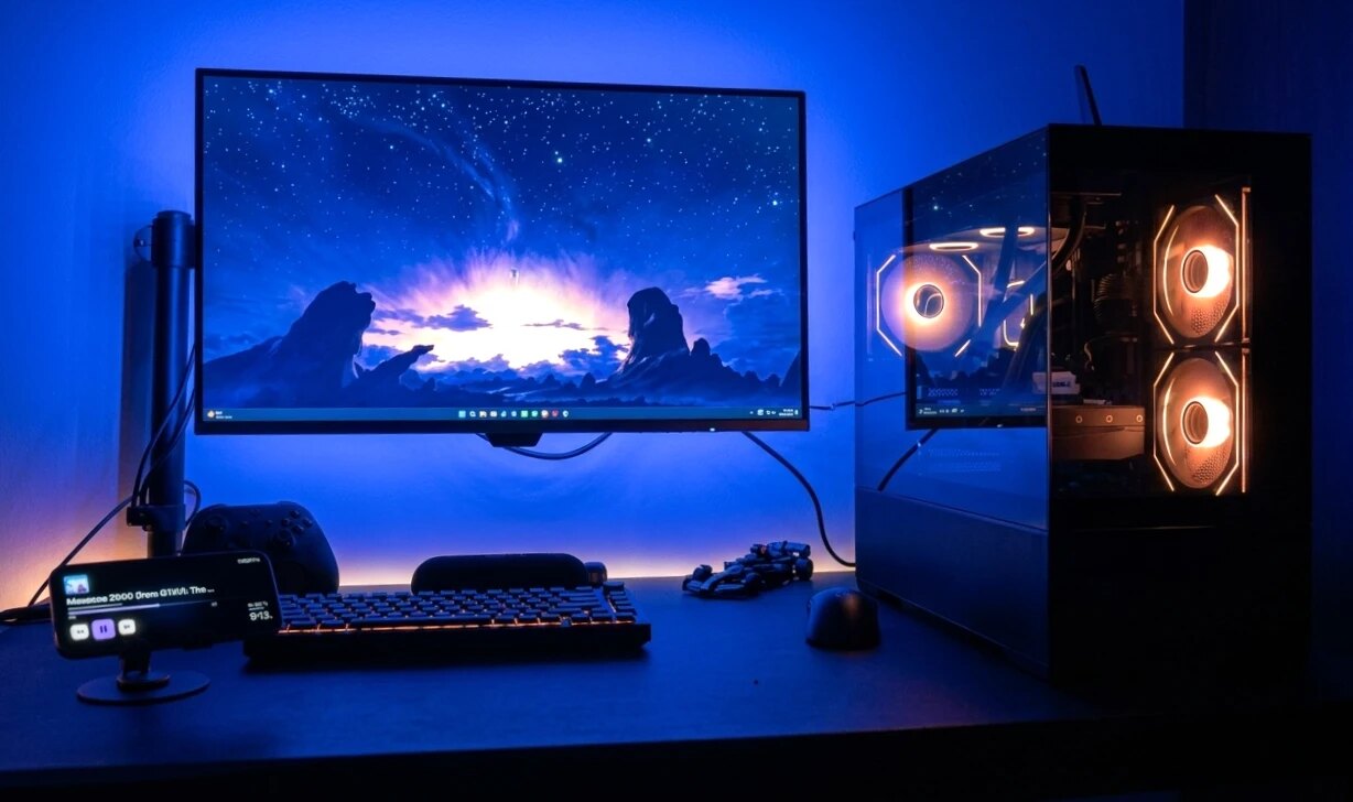
Monitor in front, phone on the charger to the left, lying in landscape. Spotify on. Mid-match, a song comes on that I don't want.

A
Alt-tab to Spotify

The game minimises, I click, I alt-tab back. Do that mid-round and you lose the round.

B
Reach for the phone

The screen is asleep, and when I wake it the lock screen doesn't rotate, so the controls are small and sideways.

The desk: monitor in front, phone on its stand to the left showing the landscape player
The desk: monitor in front, phone on the charger in landscape.

The Real Challenge

( 02 - Harder Than It Looks )
01
It has to appear by itself

If I have to open an app or press a button, I'm back to the original problem.

02
Android doesn't let apps draw on the always-on display

The dim clock a sleeping Pixel shows belongs to the system.

03
It sits on screen for hours

So it has to dim, protect the screen from burn-in, and not waste battery.

04
It must not misfire

A phone that wakes itself when turned will also wake in a pocket.

05
I can't code

Everything was described in words, then checked on the phone.

How I Worked

( 03 - Describe, Run, Screenshot, Repeat )
( The loop )

I described what I wanted, the assistant wrote the code, I ran it on my phone, and I sent back a screenshot or screen recording of whatever was wrong. Most decisions came out of that last step. I rarely knew what I wanted until I had the wrong thing in my hand.

1
Describe
What I wanted, in words
→
2
Build
Claude Code writes it
→
3
Run
On my Pixel 9
→
4
Screenshot
Send back what's wrong
↺

What It Does Now

( 04 - The Product )
( Two modes )

It appears when the phone is locked, physically on its side and one of two modes applies.

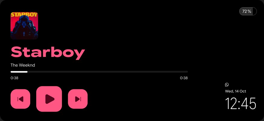
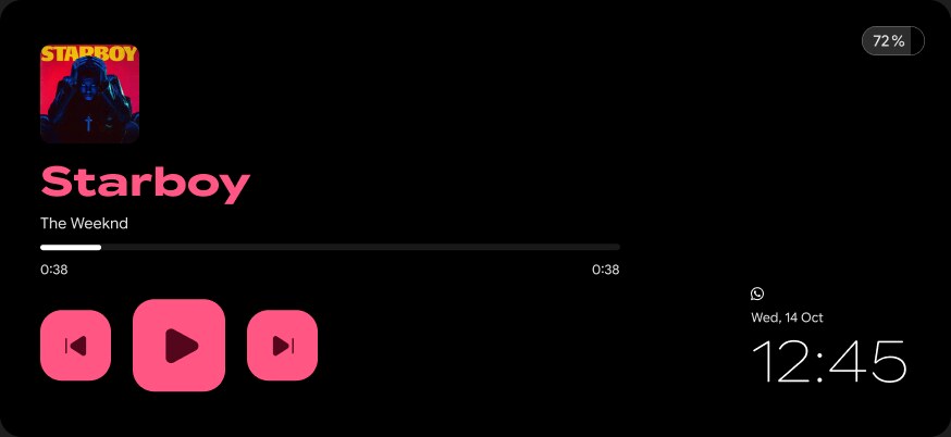
Music Player
Shows

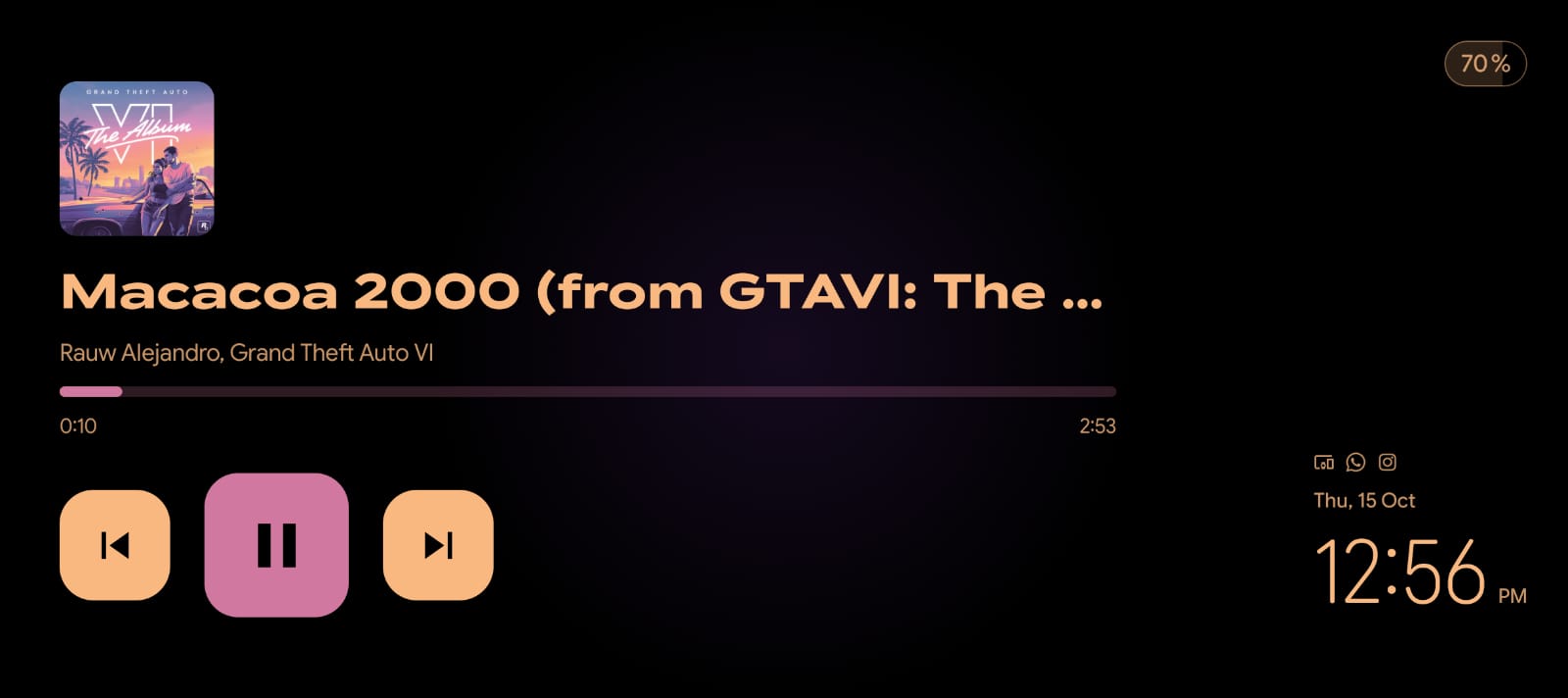
Album art, title, a progress line, three large buttons, the clock and a battery pill. Colours come from the album cover.

When

A chosen music app is playing. Optionally only while charging.

Music Player
Music Player. Colours come from the album cover.
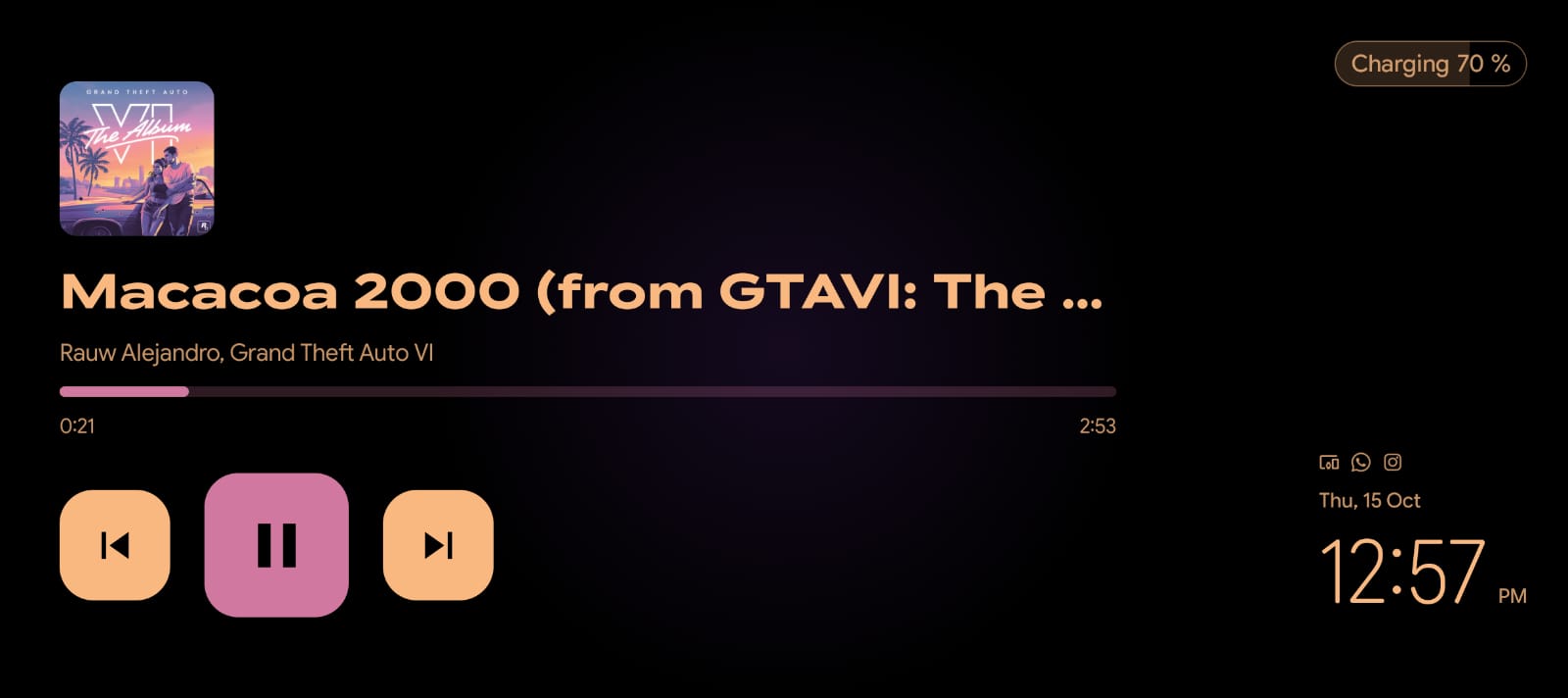
Music Player on the charger
The same screen on the charger: the battery pill reads "Charging 70 %".
Ambient Mode
Shows

A large clock with date, battery and optional weather.

When

Only while charging, by default.

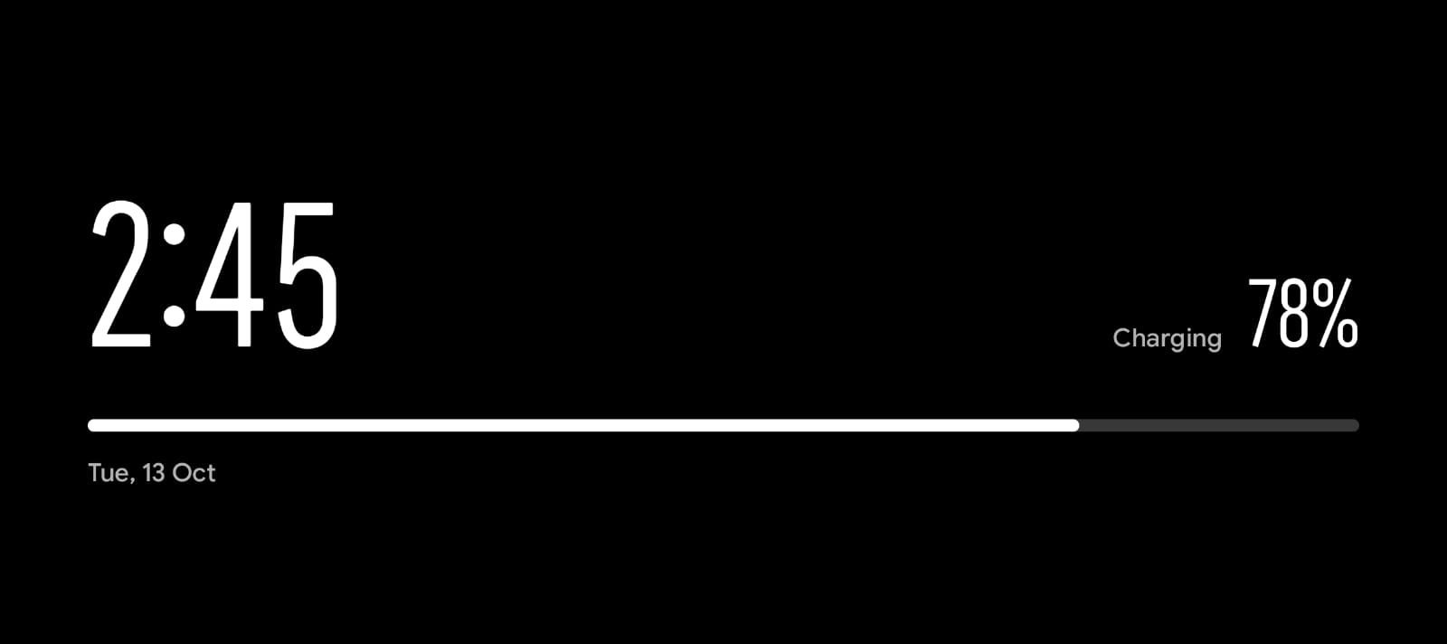
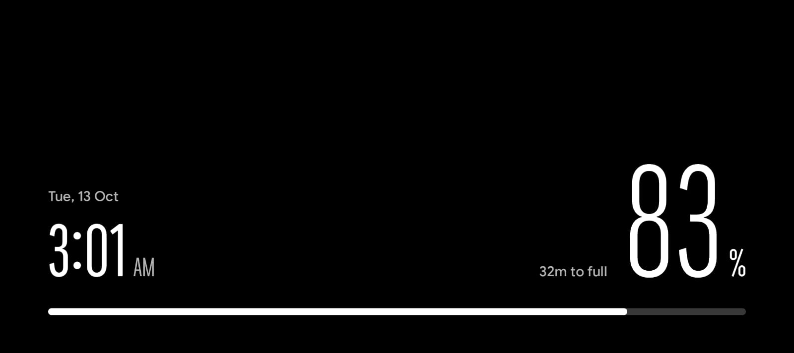
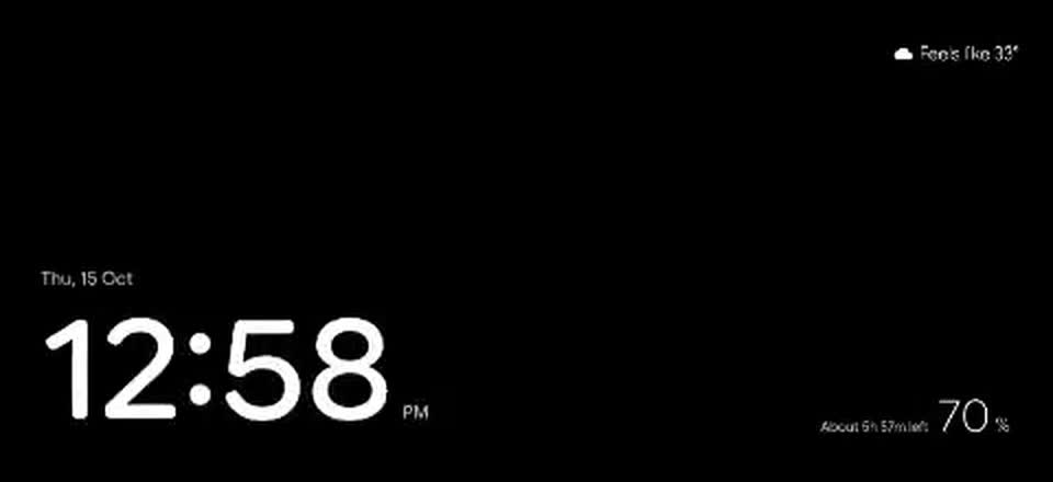
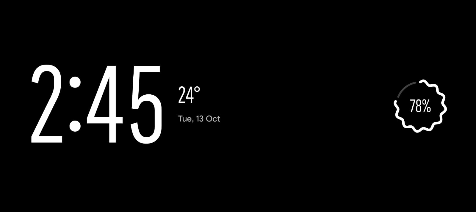
Ambient Mode off the charger
Ambient Mode off the charger: bold clock, battery time left.
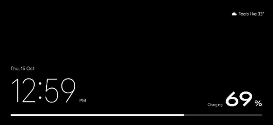
Ambient Mode on the charger
Ambient Mode on the charger: hairline clock, bold percentage, battery bar.

Problem → Decision

( 05 - Key Decisions )
01

Turn, don't tap

Problem

The whole point is not having to open anything, and the lock screen never rotates.

Decision

Trigger it from the phone's physical angle. Locked and sideways is enough; there is nothing to press. It wakes the screen itself, but checks the proximity sensor first so it won't wake in a pocket.

02

Notifications that take over, briefly

Problem

Mid-match, I want to know who a message is from without picking the phone up.

Decision

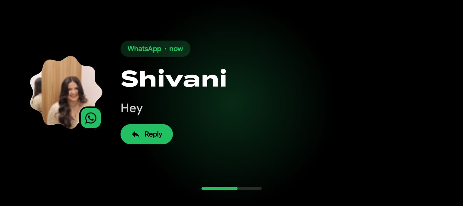
A notification that would normally alert fills the screen for 10 seconds: photo, large name, the message. WhatsApp and Slack get a Reply button. Android still shows its own small pop-up on top; hiding it would have meant either repeat alerts or no sound, so I left it.

A WhatsApp message filling the screen
A WhatsApp message takes over. The bar at the bottom counts down the 10 seconds.
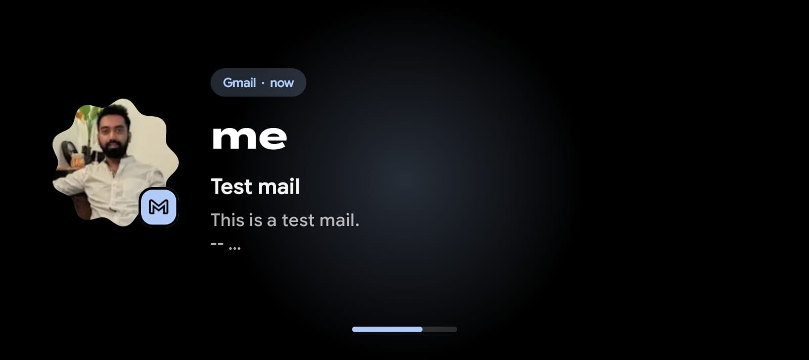
A Gmail notification filling the screen
An email gets the same treatment: sender, subject and the first line.
03

One screen that changes shape

Problem

Awake and dimmed were two different screens that cross-faded. In my words at the time: "the transition between AOD and lockscreen UI is very abrupt."

Decision

Like the Pixel lock-screen clock, each mode is one layout that morphs. The type is Google Sans Flex, a variable font, so the digits change weight and width smoothly. On the charger the battery percentage is bold and the clock is a hairline; off it, they trade.

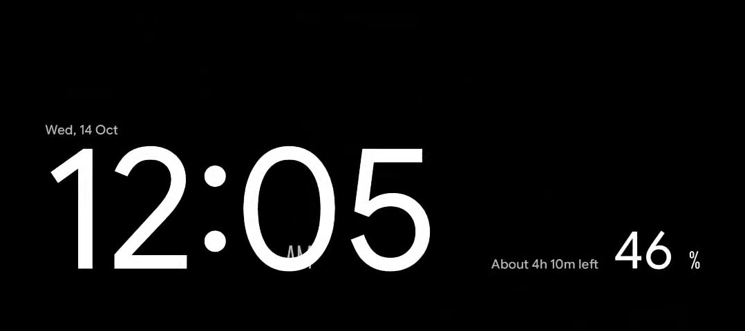
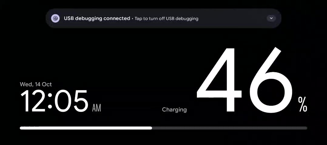
First attempt: the numbers swap sizes, but the digits keep the same shape and "AM" disappears behind the minutes.
Now: plugging in turns the clock into a hairline and the percentage bold, in one smooth motion.

It Wasn't Smooth Sailing

( 06 - A Lot Went Wrong )
( Along the way )

Things that broke, got reversed or took more than one attempt. Two of them changed how I designed, so they're told below.

9 errorsreceiver type mismatch
The first change broke the build

Errors I couldn't read. I learned to pass them on exactly.

Clocks that floated

A centred clock and a squiggle ring that said less than a number.

The morph that never ran

Reported done; my recording showed the digits never changed.

The pop-up I couldn't remove

Android's own banner still sits on top. Unsolved.

Settings modelled wrong

Told below.

Designing in sentences

Told below.

1

My settings followed my build order, not my use

I added features one at a time, and each brought a switch: "only while charging", then the clock mode, then which music apps. The result was one long list. With "only while charging" on to keep the clock to the charger, the music player also stopped working on battery, which I never wanted. I had two modes and one set of rules.

The screen made it worse. Thirteen switches in a row, and I didn't see my own second mode. My feedback at the time: "I didn't even realize there is ambient mode separately all the way down."

What changed. I organised settings around the two things the app actually does. Music Player and Ambient Mode each became a card with its own on/off switch and its own "only while charging". A card's options fold open inside it, so they clearly belong to that mode. Choosing music apps moved to its own screen.

The UX lesson

A settings screen is a model of how the product works. Mine mirrored the order I built things in. Once the structure matched the two modes, the confusing switch problem went away by itself.
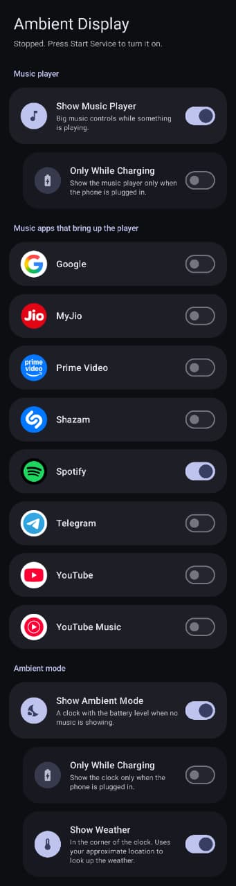
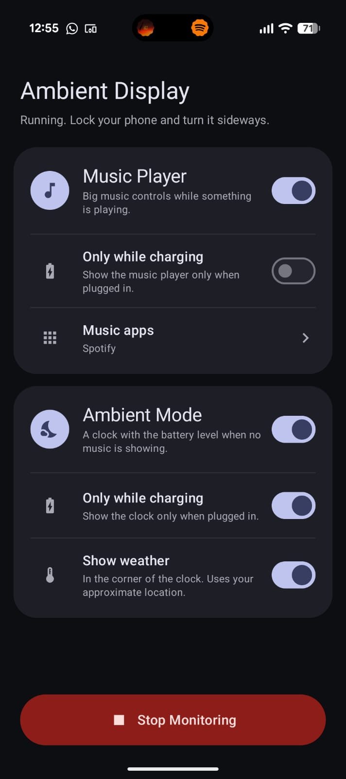
Settings before
Before: one long list. Ambient Mode is at the very bottom.
Settings after
After: one card per mode, both visible at once.
2

I designed in sentences for too long

Because I could get working software by describing it, I skipped the step I'm trained in. I redesigned the clock and the music player several times by typing things like "make the percentage bigger" and "move everything to the bottom". Each round fixed one thing and unsettled another, and I could only judge it once it was on the phone.

An early clock
An early clock, from a written description: centred, small percentage.
A later clock
A few rounds later: better, but still two separate screens.

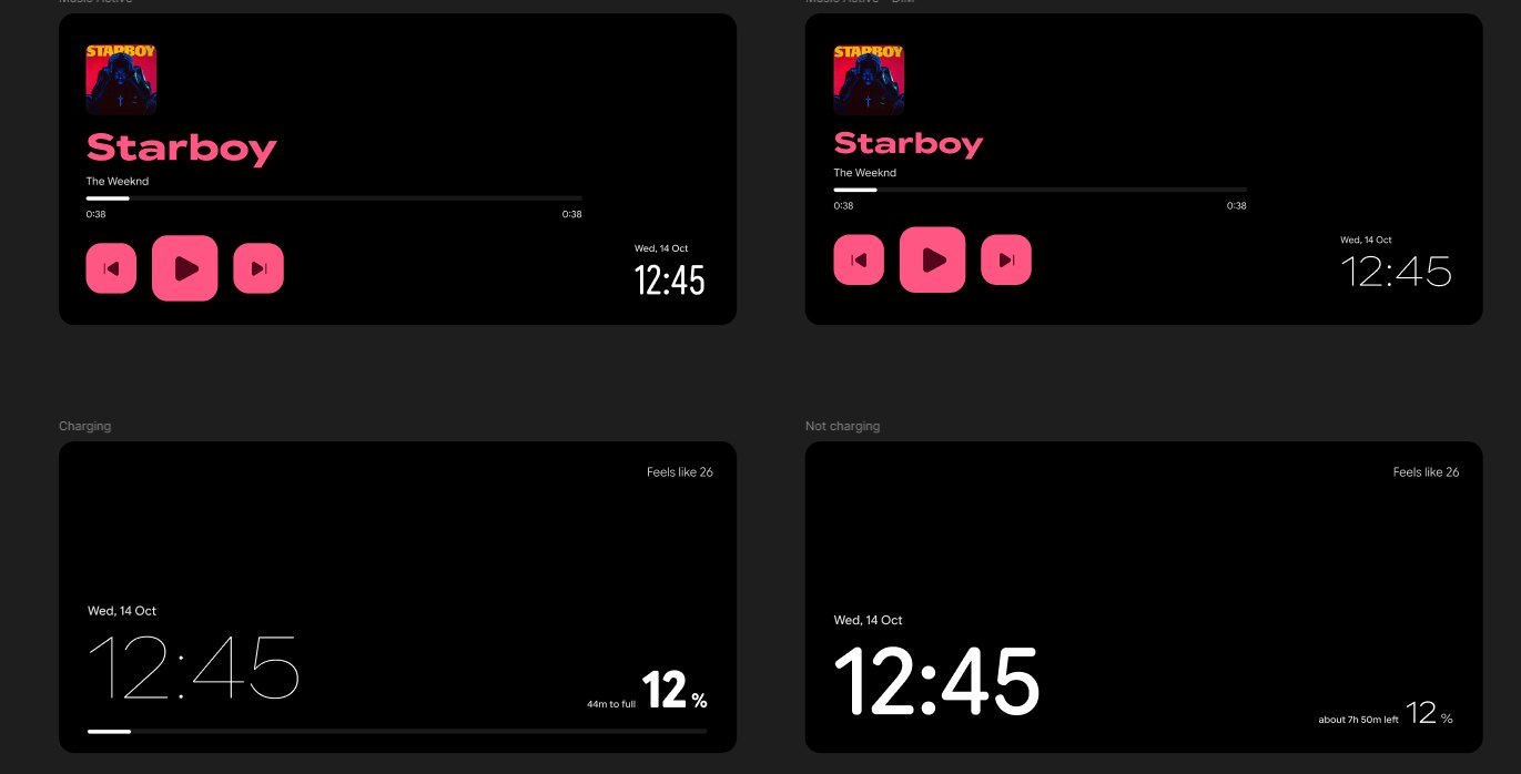
What changed. I drew five frames in Figma. Drawing settled questions in an evening that rounds of description hadn't. The music player lost its big album art for a single left column, and the clock stopped swapping sizes and swapped emphasis instead. The app was rebuilt to the file's exact sizes and font settings.

Figma frame, music player awake
Music player, awake.
Figma frame, music player dimmed
Dimmed: same layout, thinner clock, outlined play button.
The UX lesson

Words are a slow, lossy way to specify a layout. Being able to build fast is not a reason to skip drawing.

What Changed, Honestly

( 07 - Impact )
( One user )

This is a personal tool with one user, so these are my own observations, not a study.

0
Alt-tabs out of a match to change music
<1%
Battery used by the app over 24 hours
( In practice )
  • The screen is already awake and facing me. Skipping a song is one tap, with no wake, unlock or window switch.
  • It has only run on my Pixel 9, used by me.

What I'm Taking From It

( 08 - Reflections )
01
Draw it first

Building fast made me skip the step I'm best at.

02
Building made me a better judge

Things I'd have signed off in a mockup were wrong on the desk at 2am.